Sunday, May 4, 2014

The Arrival (Revision)

Everyday people are bombarded with pictures, advertisements, artwork, etc. These images are noticed because they attract the eye; create interest, essentially they are mesmerizing to look at.  This tool of using visual language is so powerful, especially when it is done from a great mind and visionary like Shaun Tan. Tan created the graphic novel The Arrival, a book that is not of the norm when you think of a comic. I say this because the book is only filled with pictures, no words to tell the story, you must figure out the visual language behind each image to understand the story.


The story is very powerful which I thought was very difficult to achieve since all Tan had were drawings to tell it. Now for the images themselves, the amount of images that are in this story is mind-boggling. Each panel is executed with such precision to keep the story riding smoothly. The images alone are gorgeous, the soft touch of the graphite reminds me of looking at clouds on a windy day. The styles of the images are what I feel made the emotion so prevalent while reading the whole story. When I finished viewing The Arrival, I had to take a look back at all the images and view the complexity that went into creating this story.


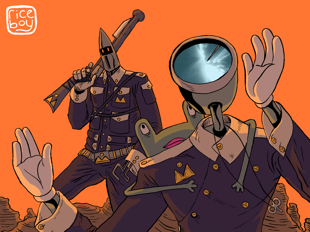
Riceboy

One of the most interesting comics I have read all semester, and the first web comic I have read. The comic starts off with a surreal feel to it, the characters stylized and the environments, everything is simple too. I mean simple because the pages were very easy to read and to understand the characters. Each character had its own personalities and yes like most comics all characters do but these had very distinct and noticeable ones. They are all dramatic and with there vague conversations. The main character is The Rice boy who is suppose to accomplish a prophecy, there doesn’t seem to be much more detail about it beyond that.

I was very impressed with the artwork, and especially the harmonization with the colors on all of the pages. The artist really knows his color theory or has a knack for it. The simplistic shapes with the characters and environments is very satisfying to the eye, the artist also puts just enough detail into each one. For example the T.O.E. his head seems to be a computer or tv monitor, and always has a new picture on the screen. These could mean something but that’s the sort of detail that I am talking about.

Great story and incredibly addictive, I can see why this web comic has such a huge following.


Arkham Asylum

This has been one of my all time favorite comics, and I think will be in that slot for a while until I come across something so groundbreaking again. The traditional and mixed media artwork done by Neil Gaiman combined with the dark writing of Dave Mckean make for an excellent twist of two remarkable artists. 

What mark this comic as something remarkable are the images on each page. Separately the pages are magnificent, showing the skill of a painter and the visual language that is told on all panels. Neil Gaiman really made an effort to have the story flow smoothly with Mckeans writing. This was achieved partially from the many different texts that they used on every page. The feeling that the artwork gives me is filled with emotion of darkness, rage and depression, and it is mostly shown in the colors and mark making. One of my personally favorite parts of the comic are when the joker has seized the asylum and calls batman to tell him that he has a girl in front him who wants to be an artist, The Joker then mentions he will blind the girl with her own pencil. This scene gave a feeling of just how insane The Joker is, along with the art visually describing the chaos depicted in the scene.

After seeing Neil Gaimans and Dave Mckeans work combined together to cultivate a true masterpiece I’m definitely going to be looking forward to reading other comics with there names on it.


Hope Larson Gray Horses

Gray Horses took me right back to when I read Shaun Tan’s The Arrival, only because the book is very picture based but it does have text I just feel the images are strong individually.

The premise of the story is to come to age to be mature and it tells this in a interesting and inspiring way. Some of the most interesting parts were the choices of shapes and colors; the peach sepia tone color that is carefully placed in each panel is to mean a remembrance.  Also it is a way to play with light in such a simple shape based design.

The story was interesting, and felt very feminine which was something that I haven’t noticed in many comics. The feeling of something you are reading to have a human and organic like quality to it becomes attractive and enthralling. 


Sin City

Both the film and graphic novel consist of what I believe is called a ‘framed narrative’. It is a large story that is comprised of many small stories. All independent action, suspense, violent, and mystery stories that are unveiled and come together in the final story. Visually, the color pallet used in both the graphic novel and film is minimal, using only greys, blacks, whites, and vivid reds and yellows. I feel as though each individual story contains all the elements of gore, romance, and excitement that make a story arc so riveting. It’s easy to relate to the characters in the setting because although Sin City is a total exaggeration of reality it is an adaptation of real and familiar scenarios. Such as violence, rape, prostitution, etc.

Sin City’s artwork to be put into one word would be bold; I say this because the style is very blocky, verging on the style of Mike Mignola (Hellboy). Because it is so bold the shape language has to be on point, and to make sense, which is carried out so elegantly.

From reading the comics I get a feeling of hidden political viewpoints that are made apparent from the several story lines that go on. This could just be something that I (personally) notice but there seem to be indications of it. From the several story lines that take place in Sin City and the interesting character development I can relate it to Watchman. I hope to continue reading Sin City as it is a favorite of mine and with the amazing artwork to feed my eyes with.